Key outcomes
- +$1.44M 1-year incremental revenue
- +4.4% individual trial start, +4.0% trial conversion
- +4.12% direct purchase
My role
Product designer — project scoping, strategy, interaction & visual design, prototyping
(Project team: 1 product manager, 1 product designer (me), 1 content designer, 2 engineers, 1 data scientist)
Timeline
First initiative designed and handed off in Q4 2023
Experiment launched in Q1 2024
GA-ed in April, 2024
Second initiative designed and handed off in Q1 2024
Experiment launched in Q2 2024
GA-ed in June, 2024
Overview
Checkout pages are critical for monetization. While revenue is the focus, it's the usability and user experience that drive seamless purchases and foster product growth.
I redefined two initiatives into one integrated effort, addressing the long-standing dark pattern, enhancing user experience, and ultimately boosting annual recurring revenue.
By redesigning two key components, I modernized the checkout system to better align with Dropbox’s visual identity and created a more scalable, systematic approach to organizing information on the checkout pages.
Before we dive in...
You are viewing a brief summary of this project. While this page doesn't show the comprehensive design process, if you're interested in learning how I arrived at the final solution, feel free to contact me for the full case study.
The problem
Users bounce at Checkout because they are not ready to pay
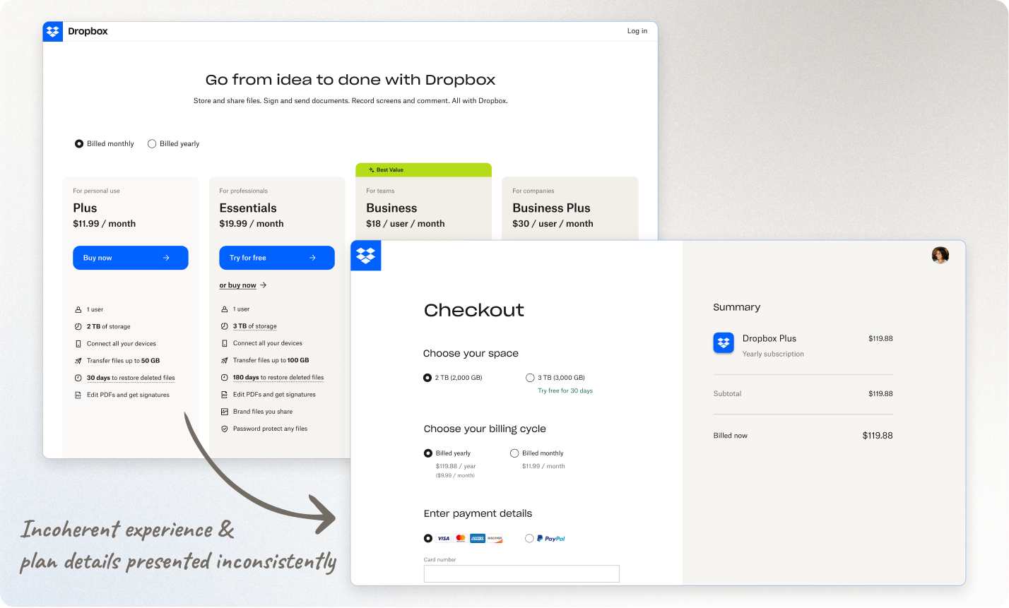
User research confirmed that the top-of-funnel user acquisition has a high drop-off rate on the checkout pages. A key issue is the lack of a coherent experience from Dropbox’s pricing page to checkout, which fails to reinforce the value of Dropbox plans. Based on this insight, my team and I hypothesized that displaying plan benefits on the checkout page would improve conversion rates, both for direct purchases and trial sign-ups. By consistently highlighting plan value throughout the user journey, we aimed to reassure users of the benefits they would receive from Dropbox.
The opportunity
How might we encourage more users to choose the yearly billing cycle
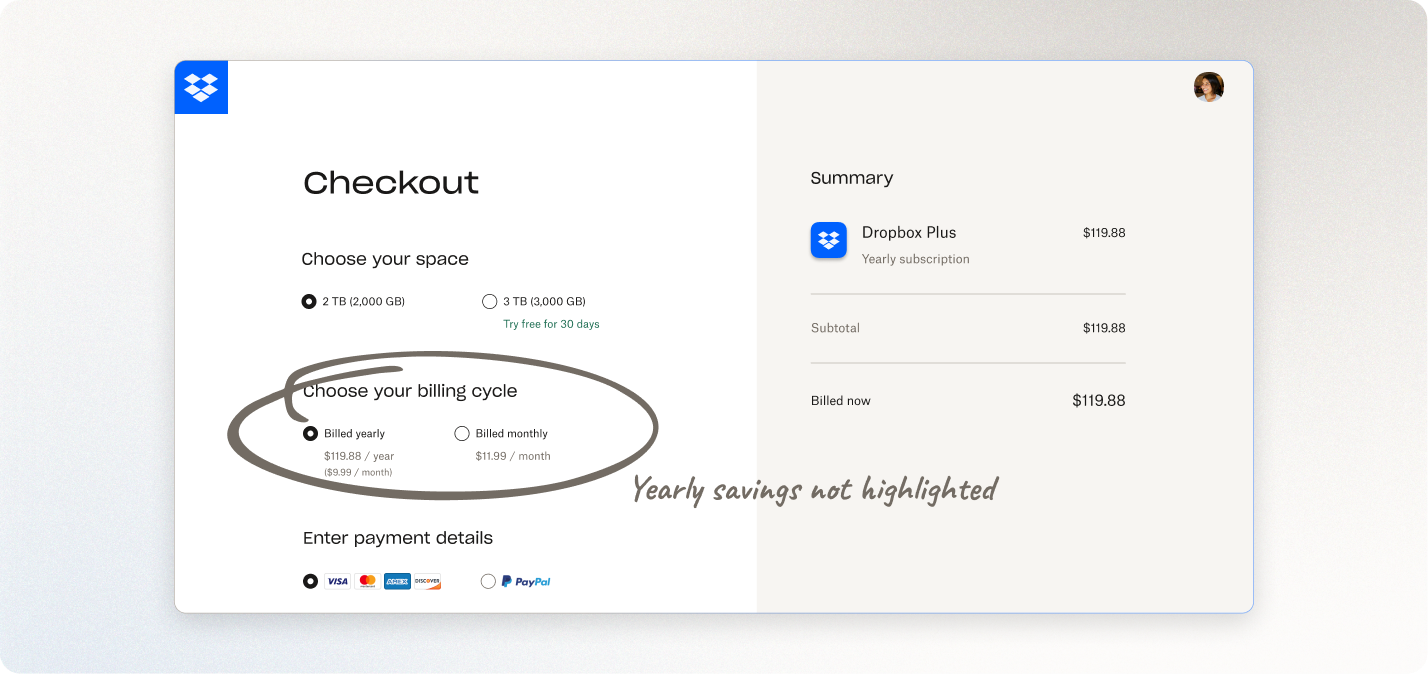
Our goal is to encourage users to stay with Dropbox longer and opt for yearly payments. However, the current radio buttons fail to emphasize the yearly discount and are difficult to compare pricing, because information is disjointed and unclear. To address this, I initiated a redesign of the selector components for both storage and billing cycle options. This redesign not only improves the information hierarchy but also highlights the yearly savings, encouraging users to choose the yearly payment option.
The dilemma
Plan upsell misleads users to change plans unintentionally
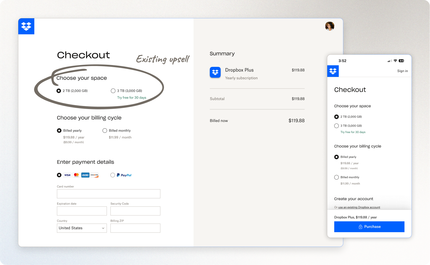
The current upsell during checkout encourages users to select the 3,000 GB free trial, but it doesn't clearly indicate that this switches them to a higher-cost plan once the trial ends. While this tactic boosts revenue for Dropbox, it negatively impacts user retention for the Dropbox Essentials plan and hinders the user experience.
Checkout is a high-risk surface that prioritizes revenue
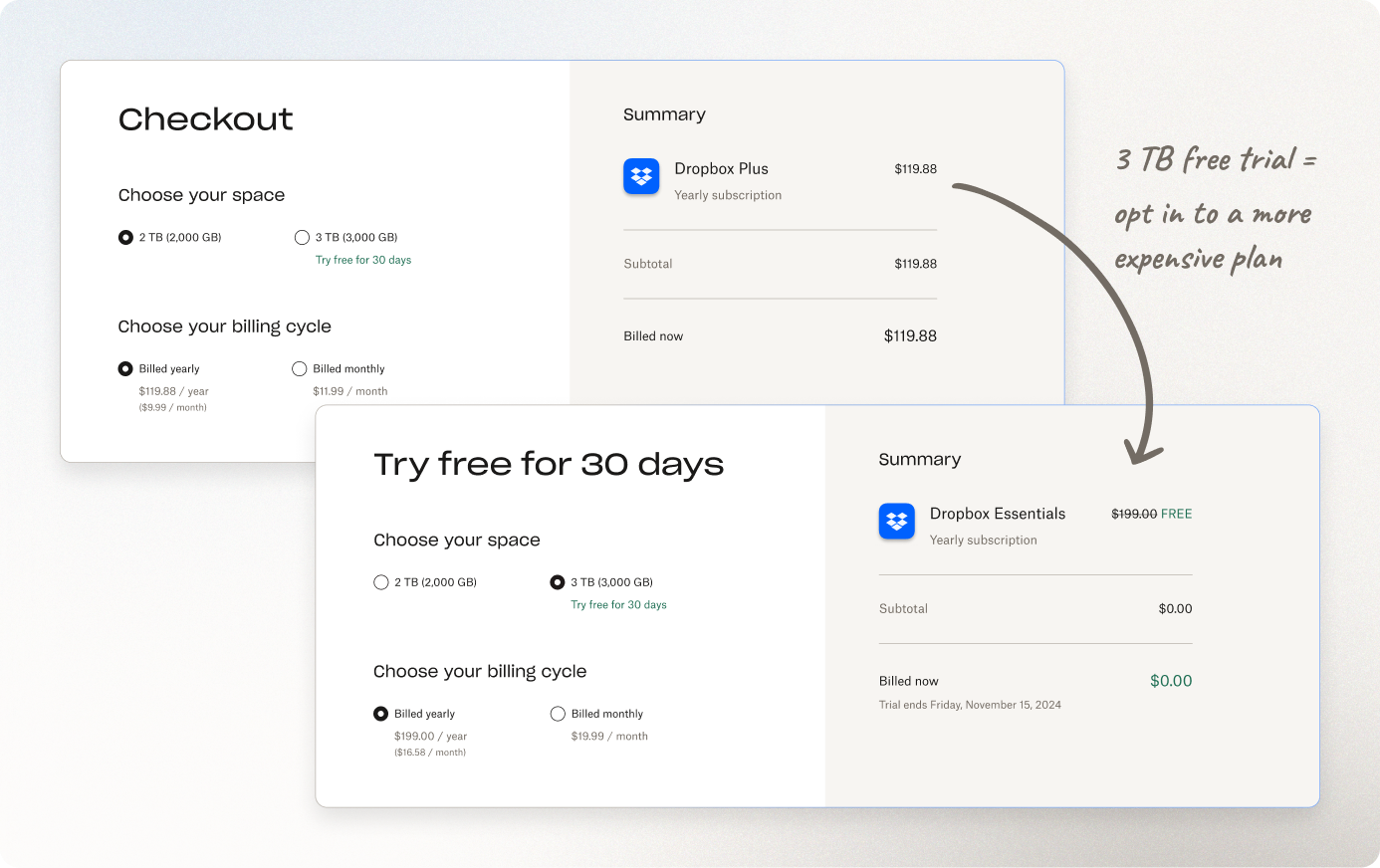
Although dark patterns are something we want to avoid, removing a feature that generates significant revenue is challenging. The checkout surface is heavily revenue-driven, making it difficult to implement changes that could negatively affect business goals.
Solution
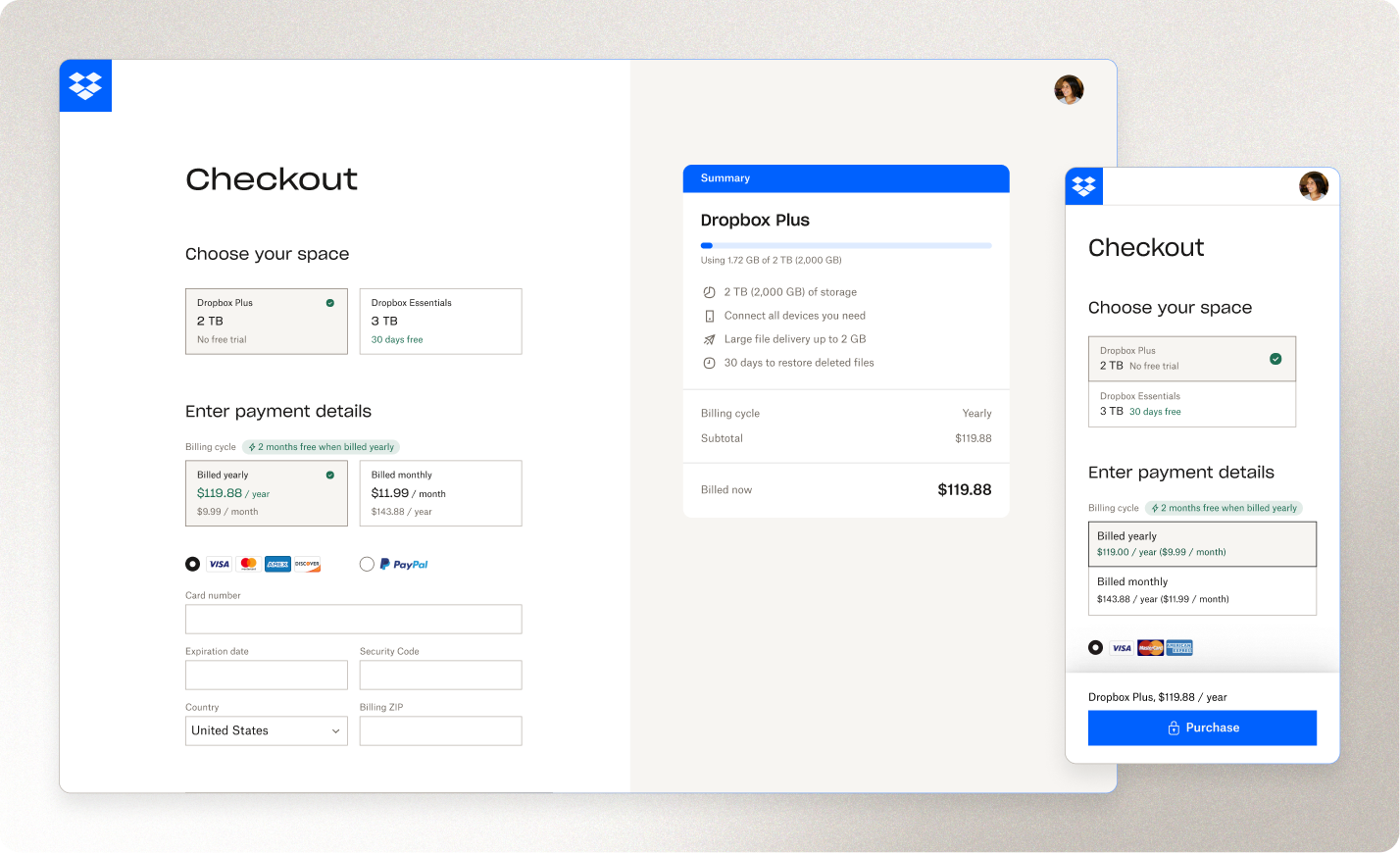
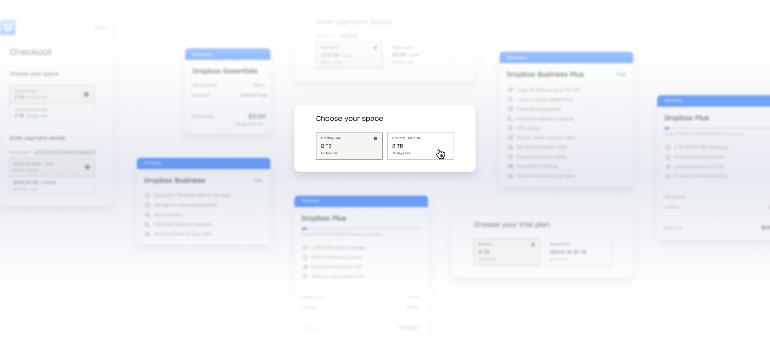
✧ New plan selector boosts transparency and highlights subscription savings
The new selectors organize essential information clearly, offering greater transparency beyond just the “storage” and “pricing”.
By displaying the plan name and free trial details, the updated selector design highlights the exclusive benefits of premium plans without employing any dark patterns.
Showing both monthly and yearly pricing allows users to easily compare options and choose their preferred payment cycle without needing to calculate the differences.
The box-style selectors not only provide clearer visual guidance for decision-making, but also group information and savings in a clean, intuitive layout. This helps users make quicker, more informed decisions with less scrolling.
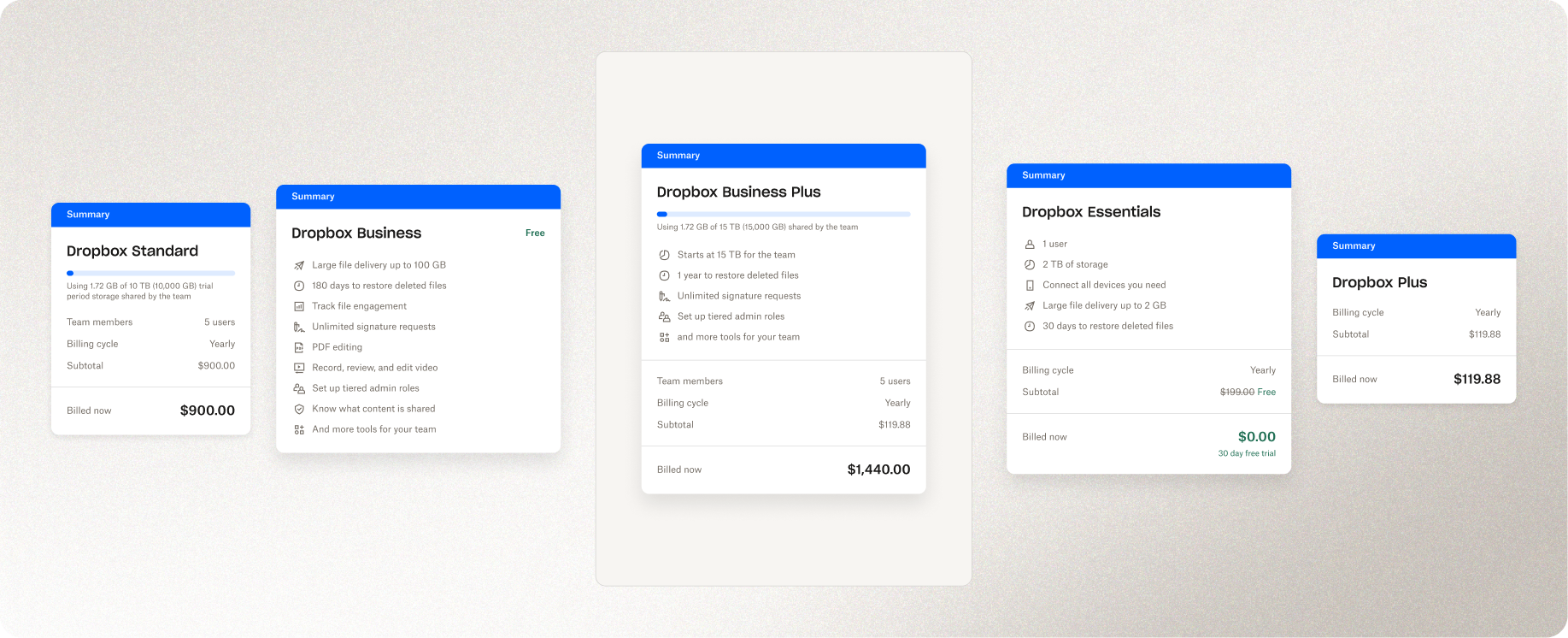
✧✧ Revamped order summary connects plan value directly to purchase decisions
Although many users arrive at checkout from the plans page, the checkout itself doesn’t display key plan features. This lack of coherent information causes users to drop off or navigate back and forth to compare among different plans.
The new order summary component addresses this by integrating plan features directly into the checkout page. This helps users better understand the value Dropbox offers, streamlining the purchasing experience and reducing drop-off rates.
The component also improves the information hierarchy, presenting essential and detailed order details without overwhelming the user. The new design makes the information easier to scan, placing more emphasis on the plan’s value rather than repeatedly showing prices, which could discourage users from completing their purchase.
Retro
I wish this never happened, because fixing a dark pattern is a tough row to hoe
Just don’t create dark patterns in the first place — it’s like digging a hole you’ll end up falling into. Prioritize transparency and user trust from the start. But if you’re like me and find yourself stuck with a dark pattern you’re dying to fix, think strategically. When dealing with existing designs, try to work within the current project scope and make “killing the dark pattern” a nice little bonus. That way, you can bundle this (probably) revenue-negative change with other tweaks that help the overall experiment come out revenue-positive.
Frustrated by small changes on high-stakes pages? Sometimes, it's the little things that count
It’s always tricky to make changes that has big impact on revenue — justifying the ROI can feel like an uphill battle. Like most designers, I’m not so excited about “small improvements.” But now I try to think more holistically — small wins can pave the way for larger decisions down the line. By breaking down a bold vision into smaller, testable tweaks, I was able to gather positive results that helped justify more significant redesign efforts later on (happening in progress now). In the end, those small steps laid the foundation for much bigger leaps.
Want to read more about my design thinking and tinkering process?
The details and process of this project is not for public disclosure. Contact me to see the full story.
