Key outcomes
- +12.7% total annual recurring revenue
- +19.3% upsell annual recurring revenue
- +1.1% gross new annual recurring revenue
My role
Product designer — research, strategy, interaction & visual design, prototyping
(Project team: 1 product manager, 1 product designer (me), 1 content designer, 1 engineer, 1 data scientist)
Timeline
Designed and handed off in Q1 2024
Developed and A/B tested in Q2 2024
GA-ed in August, 2024
Overview
The Products surface serves as the pricing page for logged-in users, with over 90% of visitors being existing paid users.
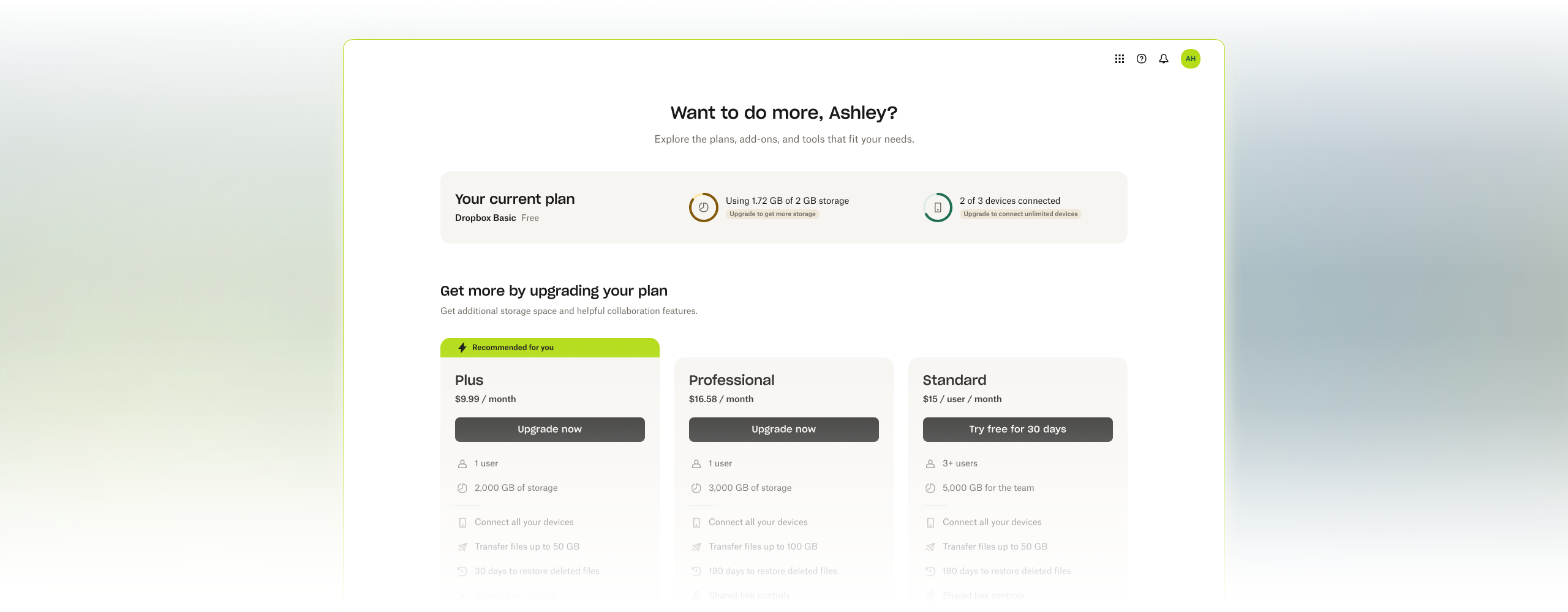
I redesigned this surface by leveraging users' plan and usage data to create a more personalized product exploration experience. This targeted approach better addresses specific user needs, resulting in improved conversion.
I also developed new growth design components that can be reused in future experiments and designs. This not only expedites engineering timelines but also reduces costs for future initiatives.
Before we dive in...

You are viewing a summary of Milestone 1 for this project. While this page doesn't show the comprehensive design process, if you're interested in learning how I arrived at the final solution or want to know about plans for future milestones, feel free to contact me for the full case study.
The problem
Current users lack a central hub to explore product options
Unlike new users who visit the Dropbox marketing site for product and pricing information, logged-in users don’t see it and are always directed to their file browsing page when they go to dropbox.com. This creates a strong need for a dedicated, logged-in product and pricing page that can effectively showcase Dropbox’s offerings. Such a page presents a valuable opportunity to upsell existing users or introduce them to other Dropbox products, driving increased engagement and revenue.
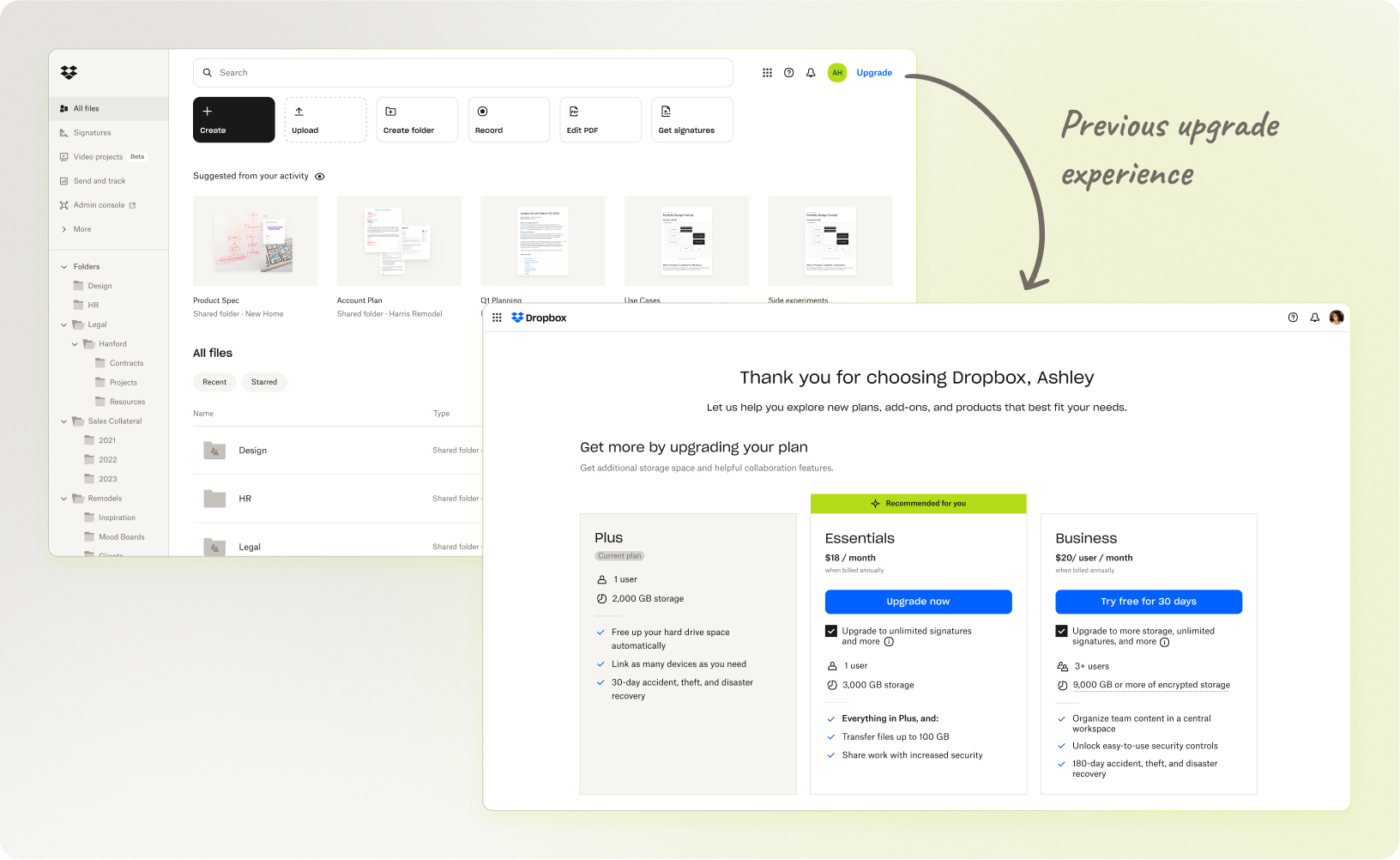
The previous Products page offered limited options and lacked a personalized connection with users. The main goal of this project is to expand purchasing options and create a more tailored experience, helping users discover the full value Dropbox offers, and ultimately encouraging more trials, purchases, and improving conversion.

It's important because...
Dropbox runs numerous upsell campaigns, but these are mostly pop-ups triggered by certain condition. We’ve been overlooking the fact that users also actively browse and explore Dropbox plans and products on their own. As we expand our product offerings to address more work-related needs beyond just storage, it's crucial to actively guide existing users to discover and adopt these new products. This will play a key role in developing the ecosystem around Dropbox’s diverse range of solutions.
Solution

✧ Contextual information helps users find what they truly need
By offering more personalized recommendations based on how users interact with Dropbox, we can make it easier for them to connect their needs with additional products and features, ultimately leading to more informed purchasing decisions.
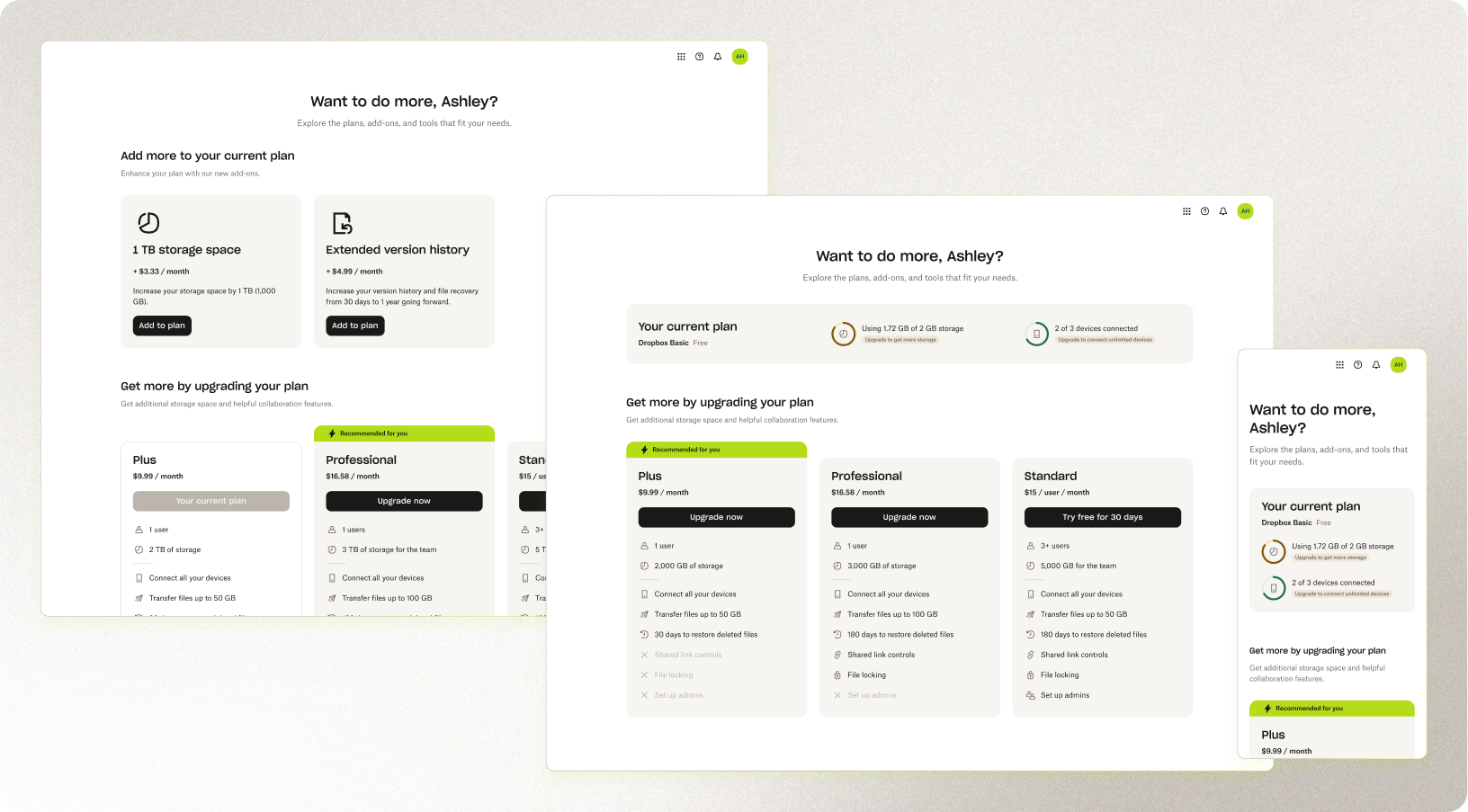
The new design prioritizes showing users their current usage while highlighting relevant add-on recommendations. This section, placed prominently at the top, allows users to easily enhance their plan with smaller, tailored add-ons instead of pushing them toward more expensive plans that might lead to churn. By offering more targeted solutions, my design empowers users to customize their plans and better address their specific needs.
The updated content design of the plan cards enhances the user experience by making it easier to understand and compare each plan’s value propositions. While the previous design it difficult for users to compare plans side-by-side, the new design provides clear, well-structured information with an intuitive visual hierarchy. This approach simplifies the comparison process and helps users make purchasing decisions more easily.

✧✧ Componentized design patterns to enhance efficiency and ensure consistency
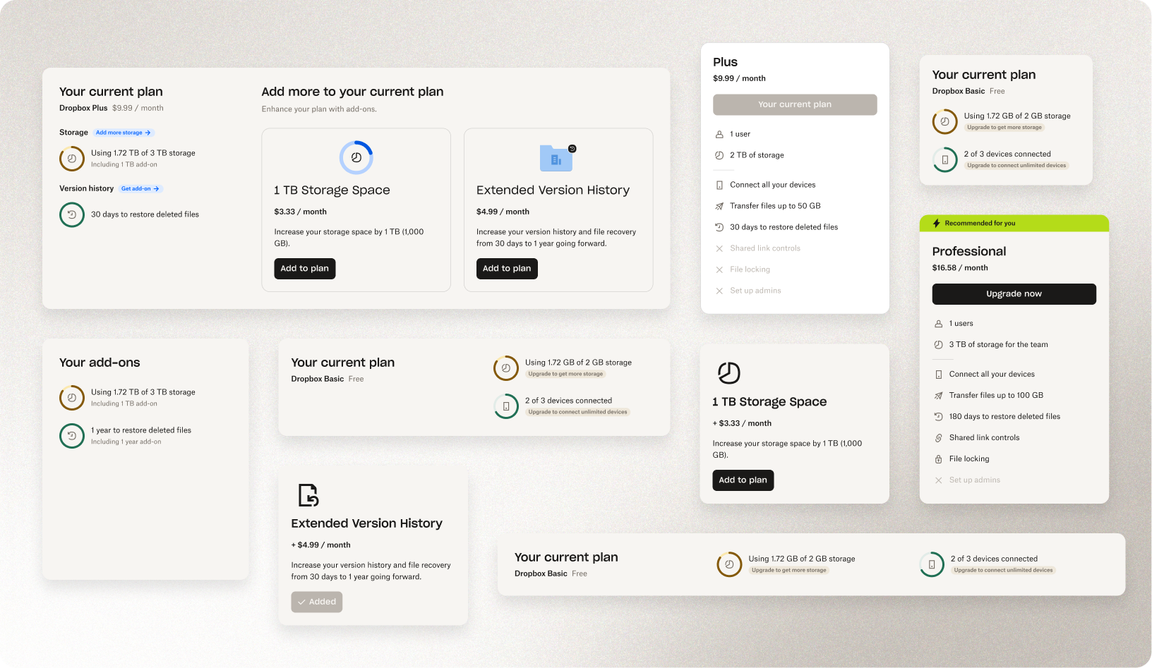
Beyond the product and business goals of this project, I developed reusable components to streamline implementation for future experiments and accelerate development timelines. These components also ensure that future designs for similar initiatives remain consistent and cohesive, helping to maintain a unified user experience across growth surfaces.
The top section component is designed to adapt to different widths and incorporate varying information for future milestones. Additionally, the new usage indicators are componentized to support ongoing experimentation. By adding these elements to the growth component library, I improved efficiency and scalability for following and new experiments.
Retro
Low margins, high volume: driving revenue through scale
Sometimes we get so caught up chasing big wins that we overlook the low-hanging fruit. Even though previous attempts showed that selling add-ons wasn’t as profitable as plans, I decided to give it another shot with a new approach—and it worked! The key was incorporating personalization and customization, which brought new life to this overlooked opportunity. And really, it makes sense—users love personalized, à la carte options that feel cost-efficient compared to something more expensive that they’re unsure about its use.
It’s worth noting that reviving add-ons wasn’t a revolutionary idea, and retrying past failures can feel risky, even pointless, especially when data says, “this didn’t work.” But just because the experiment looks similar doesn’t mean the outcome will be. With a refined strategy and improved design, you can completely change the game.
Building reusable components to support future experiments
Honestly, a lot of our design and engineering efforts in growth have gotten lost in the shuffle of countless experiments. We end up starting from scratch more often than we’d like. It’s somewhat expected — growth is all about trying new things and experimenting with design patterns that haven’t been used elsewhere. But does that mean we can’t maintain a component library for growth? Sure, the library might get a little messy at times. But even just keeping track of what works, streamlining engineering efforts, and speeding up launches makes it totally worthwhile. I’m still working closely with our engineers to set up this library for wider use—stay tuned!
Want to see more process, strategy, and milestones planning?
The details and process of this project is not for public disclosure. Contact me to see the full story.
